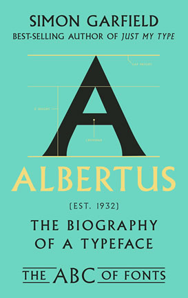
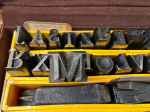
The ABC of Fonts: Albertus, Baskerville and Comic Sans
Brief extract from Albertus
In a now-famous thought experiment, the type designer Cyrus Highsmith once tried to plan a day in New York without Helvetica. A tough assignment, for it was everywhere: dollar bills, breakfast cereals, morning newspapers, subway lettering.
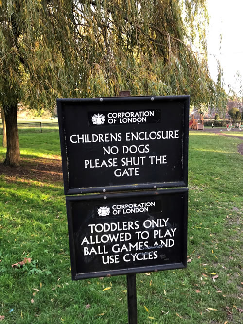
Albertus is not Helvetica; perhaps, conducting a similar experiment in London, I would have an easier time. But that meant not going for a walk on Hampstead Heath, managed by the Corporation of London, where Albertus handles all the information and instructions, if not all the grammar: ‘Childrens Enclosure. No Dogs. Please Shut The Gate. Did You Know: All the money we gain from car parking will be used to help keep Hampstead Heath a safer, healthier and more attractive open space.’ Wolpe’s work, in its ninetieth year, is also there for ‘Women’ and ‘Men’.
Off 300 miles, then, to the many charms of St Ives, Cornwall. Here one can walk coastal paths and tour the Tate and Barbara Hepworth’s house and see no Albertus at all. Things get trickier along the main thoroughfare Fore Street, however, where the Methodist Church says, ‘We Worship Jesus Christ as Lord’ and the Bible Christian Chapel up the road announces, ‘Christ Paid the Penalty for Our Sins’ (in Albertus). The sign at Lulu’s kebab shop on Tregenna Hill says ‘Special Pizzas’ in Albertus; you can eat them riding with the St Ives Bus Company, with its logo in Albertus.
 Back in London where the street signs say ‘Great Tower Street’ and ‘Old Fish Street Hill’ and ‘London Bridge’ in Albertus, one might go on to the Queen Street Laundry by Southwark Bridge and the nearest Curzon at Aldgate East for a new print of Jean-Luc Godard’s Breathless (with the poster in Albertus), and hang around for David Lynch’s Dune (screen credits), and then return a week later for the John Carpenter season, featuring Escape from New York, The Thing, Christine, Starman, Big Trouble in Little China, Prince of Darkness, They Live and Escape From L.A. The opening screen credits are all in Albertus, obviously. The consistent framing of Carpenter’s movies created a reassuring sense of homecoming to his fans, and then he’d blow that up. There is also a John Carpenter Street (in Albertus) in Blackfriars, although that’s a different John Carpenter (1372–1442, town clerk, founder of City of London School).
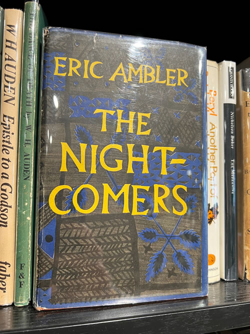
 You get the idea; it can get very annoying for those you’re with. Obviously you should never venture into the huge Waterstones in Piccadilly, because even if you buy something that doesn’t have Albertus on it, a person behind the counter will offer you a nice tote bag with the shop name in Albertus. A few yards along, at Hatchards, the shelves by the payment desk offer the most alluring first editions: The Night-Comers by Eric Ambler; Autumn Journal by Louis MacNeice; Wilfred Thesiger’s Arabian Sands; Other Voices, Other Rooms by Truman Capote. All wrapped in cellophane, all wrapped in Albertus.
And you can’t relax with television at home. Even if you escape the opening credits of reruns of The Prisoner, you’ll run into the titles for Jihad, a documentary on Amazon Prime about Afghanistan’s latest holy war, or you’ll notice something familiar about the book jacket of a memoir written by, of all people, Spock, titled The Many and the One, which appears in Star Trek: Picard. And the typeface on the door of the insurance racket Claffin & Sons in Sharon Horgan’s murder comedy Bad Sisters looks like Albertus too, because it is Albertus.
And not much joy in music: Nick Cave’s album Ghosteen; Metronomy’s Small World; Coldplay’s Parachutes; New Order’s ‘Ceremony’ single; The Beach Boys’ Surfin’ Safari; Elvis Costello’s collaboration with the Roots, Wise Up Ghost, and his song cycle with the Brodsky Quartet The Juliet Letters.
Sport – always relief in sport, so long as you’re not a Liverpool fan: that ‘Players’ Entrance’ sign at Anfield looks familiar, as does the badge on a Stoke City shirt, as does the Nike website for basketball superstar LeBron James: ‘Greatness Is A Journey’.
If a designer chooses Albertus, I think I will get to know about it fairly soon. It is like discovering an old friend for the first time, a feeling that Wolpe’s parents would have identified as Gemütlichkeit, a warming comfort, and I’ve spoken to other type enthusiasts who have similar feelings towards Futura. Sometimes I wish it would leave me alone. I have at least three hundred photographs of Albertus showing unique usage, and only someone who’s totally insane would have more.
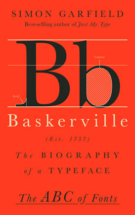
Brief extract from Baskerville
On Thursday 14 July 1791, about ninety men gathered for a late lunch at the Royal Hotel in Birmingham, and as soon as it was over the town went up in flames.
The diners had spoken of inflammatory things – freedom of speech, religious tolerance, support for the French Revolution – and no one present could have been surprised at the fearful reaction that greeted them. The timing of their celebratory meal, on the second anniversary of the storming of the Bastille, was provocative enough, and it was greeted in the days before by unguarded threats.
The mob that greeted the enlightened and privileged diners were after one man in particular, the brilliant chemist, political theorist and radical preacher Joseph Priestley. Today we remember Priestley for his discovery of carbon monoxide, ammonia, hydrogen chloride and other gases, and for his co-discovery with Carl Wilhelm Scheele of oxygen, but his enemies marked him out as a dangerous individualist who thought little of challenging age-old institutions. He had been advised not to attend the lunch, but his absence was no defence when the rioters attacked his house at Fair Hill. He escaped with his life and family, but his lab-oratory and most of his possessions were torched.
 The following day the mob went looking for other targets, including Moseley Hall, the family home of John Taylor, the son of the co-founder of Lloyds Bank, and then on to the home of William Hutton, an alderman and bookseller, and Birmingham’s first historian. Twenty-seven private residencies were destroyed before constables stepped in and read the Riot Act (they were in no hurry; they too saw the dissenters as disruptive to their well-being). Another target was John Ryland, who had made his money from wire and pins and lived at Easy Hill, a seven-acre estate overlooking the city, a fabled mansion of mahogany and marble, china closets, good cellars, seven bedrooms, servants quarters, a brew house, pumps for both soft and hard water, a four-stalled stable, a coach house, a greenhouse, a workshop, fish ponds and a grotto. William Hutton described it as paradise.
 This too was set ablaze, leaving a brick shell and, because they were too drunk to get out from the cellar in time, the charred bodies of several rioters. Among the ruins on the estate stood a strange-looking conical building that was once topped by a windmill. By the side of the mill, which was perhaps once used for paper production, or perhaps iron flattening, lay a mausoleum with the inscription:
Stranger –
Beneath this Cone in Unconsecrated Ground,
A Friend to the Liberties of mankind Directed his Body to be Inurned
May the Example Contribute to Emancipate thy Mind From the Idle Fears of Superstition
And the Wicked arts of Priesthood.
The mob couldn’t touch him, can’t touch him still, for here in the earth lay John Baskerville. Only many years later would they dig him up, and then dig him up again, and bury him for the third time, but that’s a darker story.
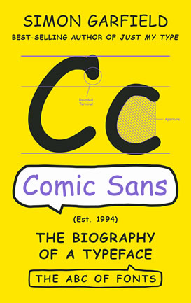
Brief extract from Comic Sans
In late September 2022, an email from the graphic designer Paweł Adamek arrives at the podcast Football Clichés, an obsessive and entertaining listen from The Athletic about how we talk when we talk about the national game. The recipient is Adam Hurrey, the host; for this episode his guests are The Athletic journalists Charlie Eccleshare and Nick Miller:
Hi Adam, I thought this could be of potential interest. I visited the Camp Nou recently (the home of Barcelona FC). I couldn’t help but notice that loads of the trophies in their trophy cabinet had their text engraved in the font of none other than Comic Sans, including the La Liga and Copa del Rey. (Adamek’s former clients include the National Air and Space Museum in Washington DC, the Postal Museum in London and Marks & Spencer.) Which is insane, because it’s a shit font and a bizarrely inappropriate choice for this purpose.
Hurrey asked Eccleshare how he felt about Comic Sans being used on such an important trophy, adding ‘I wouldn’t even accept it at Under-13s level’.
Eccleshare said he’d be so disappointed if he’d worked so hard for something and it was so devalued in that way.
Miller added that Comic Sans looked like a slightly trickier font to engrave than one of the more traditional ones.
Hurrey said that the designer of the font has had to defend it a lot. ‘It’s become infinitely shit, hasn’t it, of course? Almost ironically so. He defended his font almost like Alex Ferguson defending his signing of Juan Sebastián Verón. He says, “If you love it, you don’t know much about typography. But if you hate it, you really don’t know much about typography either, and you should get another hobby.”’
‘That is punchy!’ Charlie Eccleshare said.

Vincent Connare
‘He went on to say that Comic Sans does what it was commissioned to do,’ Hurrey continued. ‘It’s loved by kids, mums, dads and many family members. It did its job very well. It matched the brief.’
‘I can see his frustration there,’ Eccleshare added. He’s like, “Obviously don’t use it on the Copa del Rey. That’s not on me. I designed it for kids.”’
Hurrey then asked Nick Miller what font would look better on a trophy. ‘Times New Roman would be fine, right?’
‘Yeah probably,’ Miller said. ‘Helvetica? The design classic – that would look quite nice I think.’ As Hurrey later wrote in his column, the debate wasn’t new. The anomaly of Comic Sans had been noted in 2010 by Spanish newspaper La Vanguardia, whose writer had pinned the blame, as he saw it, on a jeweller in Madrid named Fernando Alegre. The Copa del Rey had recently been won for the fifth time by Sevilla, enabling the club to keep the trophy for good. Señor Alegre was entrusted to make a new trophy, and select a typeface for its engraving. La Vanguardia did not ask him about his choice, but it did weigh in on its appropriateness. Comic Sans was not the ideal choice, being better suited for ‘PowerPoint presentations made by school children, informal texts, and obnoxious email chains’.
(When I emailed Hurrey about his podcast conversation, and whether he knew of any other instances where Comic Sans had been used on a major trophy, he replied that he knew of no others. He pointed me towards the controversy over the type used on the 2022 England football shirts, a nasty jagged affair on which players’ names appeared in all upper case, apart from players with an i in their name (BELLiNGHAM; DiER) which appeared, quite inexplicably, in lower case.)
These days, Hurrey concluded, Comic Sans ‘has been so historically ridiculed that it’s actually become uncool to ridicule it’.
Did this, therefore, now make it cool?