Just My Type (US edition)
Just My Type (US edition)
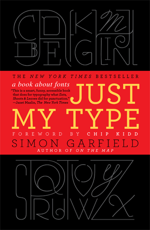
The beautiful US edition is now available from Gotham/Penguin, and in-store promotions included a poster of the book’s Periodic Table of Typefaces (see right). Here are some US and UK reviews.
• This is a smart, funny, accessible book that does for typography what Lynne Truss’s best-selling Eats, Shoots & Leaves did for punctuation: made it noticeable for people who had no idea they were interested in such things. -Janet Maslin, New York Times
• Just My Type is a genre-bender of a typography book – part history textbook, part design manual, part subtle stand-up comedy routine. Garfield dances across 560 years of typographic history, sprinkled with fascinating anecdotes and vignettes, to infect you with his own inability to walk past a sign without identifying the typeface and some curious factoid about it. Funny and fascinating, irreverent and playful yet endlessly illuminating, the book is an absolute treat for the type-nerd, design history geek, and general lover of intelligent writing with humor.” -The Atlantic.com
• Garfield takes readers on a rollicking tour of the world of typography. –USA Today
• Garfield’s engaging history of letter design will be eye candy…[Just My Type is] stuffed with fascinating bits of information…lively, richly illustrated -NPR.org/Books We Like
• Whether you’re a graphic designer or a layperson with no background in this area, reading what Garfield has to say will change the way you perceive the written word forever. It might even lead you to make more discerning choices the next time you have a desktop publishing project in front of you. The take-away from Garfield’s book is simple: Contrary to reports of its premature death, print is very much alive.” –Los Angeles Times
• Just My Type, is informative, delightful – and essential reading for word geeks everywhere.” –The Seattle Times
• Deliriously clever and entertaining. –The Boston Globe
• Here is a wonderful update for those whose fondness for matters typographical predates the digital age, as well as those whose eyes need awakening to this particular enchantment. Garfield has a light touch and moves effortlessly among various aspects of typography past and present, not only from design perspectives but from accessible social, historical, and legal angles as well. Throughout, Garfield offers “fontbreaks” in which he focuses on the provenance of a particular typeface. An added pleasure: the book’s own text switches fonts to briefly reflect the typeface under discussion. -Starred Library Journal
• [A] lively romp through the history of fonts. Garfield’s evocative prose entices us to see letters instead of just reading them.-Publishers Weekly
• A thoroughly entertaining, well-informed tour of typefaces. –Kirkus Reviews
• Whether you’re a hardcore typophile or a type-tyro, there’s something here for you: be it the eye-opening revelations of Eric Gill’s utter and complete perversity, or the creation of the typeface that helped Mr. Obama gain entrance to the White House. -Chip Kidd
• There is even a photograph of a quick brown fox literally jumping over a lazy dog. What a clever, clever book. -Lynne Truss
• Did I love this book? My daughter’s middle name is Bodoni. Enough said. -Maira Kalman
• With wit, grace and intelligence, Simon Garfield tells the fascinating stories behind the letters that we encounter every day on our street corners, our bookstore shelves, and our computer screens. -Michael Bierut, Partner, Pentagram Design, New York, and author of Seventy-Nine Short Essays on Design
• Simon Garfield reveals an invisible world behind the printed word… the lives of the designers and the letters they’ve created have never been more clearly detailed with so much flair. -Jessica Kerwin Jenkins, author of Encyclopedia of the Exquisite
• Delightful… Just My Type is the kind of book that makes you look at the world differently. Indeed, it can induce a mild obsessive compulsive disorder…. Like a master sommelier, Garfield has a wonderful capacity to convey the little hints and barely registered associations which different fonts impart… an ingenious book. – Stuart Kelly, Scotsman
• Dozens of compelling anecdotes are clearly told by Simon Garfield in this eye-opening book, which is utterly convincing in its central idea – that we are surrounded by fonts and influenced by their subtle message… a delightful, brain-expanding book. – Harry Mount, Mail on Sunday
• Garfield’s great strength is his storytelling. His book comprises dozens of lovely vignettes, anecdotes that make a potentially dusty subject utterly compelling. – Archie Bland, Independent on Sunday
• Hugely entertaining … a lively history … My considerable enjoyment of this book may have been enhanced by the fact that I’ve always been very interested in print design. But even those who have never considered the beauty of the Baskerville Q … should find themselves being drawn in by Garfield’s enthusiasm and wit. – Anna Carey, Sunday Business Post
• A quirky introduction to fonts… Simon Garfield is careful to tickle as much as he teaches… Just My Type is fun. If you have ever looked at the drop-down menu in Word and wondered what a Garamond is, or what’s meant to be new about Times New Roman, Garfield will be just your type. – Peter Robins, Daily Telegraph
• He convinces us it’s okay to actually like typography. What shines about this book is its accessibility; you don’t have to be a typeface historian or a designer to find it enthralling… It’s fascinating to read about the history, origins and revolutions of typefaces, and this book strikes a great balance between fact and humour. Garfield’s book isn’t snobbish or elitist, and this is its most refreshing quality – it’s for everyone to enjoy and share… Reading this book may just change your life; it’ll certainly make you smile. If nothing else, it’ll make you appreciate the beauty – and sometimes the horror – that is all around you. – Nick Booth, Time Out
• Brilliant… Whether you’re a graphics geek or have never given a second thought to what you’re reading, don’t miss this quirky, fact-filled font fest. – Lauren Laverne, Grazia
• Light-hearted but comprehensive, from rather odious typefaces, such as the hairy Grassy, to the ubiquitous Helvetica, each font is given a rundown. Garfield says he’s unable to walk past a sign until he has identified the typeface. Now, neither can we. – Monocle
• A celebration of our way with words – Observer
• Chatty, anecdotal … illuminates even a walk to the shops – Sunday Times
• Superb… it is a fascinating and funny book that delves into the history and oddities of typefaces throughout the ages… it’s full of weird and wonderful stories. – Doug Johnstone, Big Issue
• Just My Type is a font fanatic’s dream – Alison Flood, Wired Magazine
• He’s extremely knowledgeable about type history while ignoring the politics and egos… The tone is often funny and always entertaining… thoroughly enjoyable. – Steven Heller, FT
• A delight from start to end – The Age, Australia
• Punchy and entertaining overview of typography… Garfield’s intriguing book can send you online to look more deeply, typographically speaking into the character issue. – Liam Stebbing, Irish Times
• Garfield has a track record of making odd subjects fascinating… a weirdly addictive book. – Saga
• Engrossing… I’ve long been a fan of Garfield’s popular touch, but he also writes knowledgeably about the minutiae of printing and layout The book is attractive too… for this book’s many pleasures he should, at least, have a typeface named after him. – Nick Curtis, Evening Standard
• Equipped with both knowledge and a nimble way with words, Garfield is an entertaining and congenial guide to this ubiquitous but little-known world. – Jeremy Lewis, Literary Review
• A quirky and informative study of fonts – Anthony Horowitz, Sunday Telegraph Books of the Year
• Bouncy, well-informed and wittily designed… an engaging book. – Jonathan Glancey, Guardian
• Amusing and informative… Just My Type is an immensely refreshing offering from an author who is fascinated by his subject. Conveying the richness and the personality of typefaces with love and passion, this is an accessible and entertaining introduction to the world of lettering. – Patrick Myles, Blueprint
• There’s a ton of fascinating stuff you never knew about fonts and thankfully Simon Garfield has stuck practically all of it in this friendly and informative book about the subject… packed with nuggets that are way more relevant to your cool young life than you might realise… Riveting, and truly educational stuff. – Stuart Hammond, Dazed and Confused
Can A Font Make Me Popular?
When Matthew Carter arrived for drinks at a private club in Leicester Square in May 2009, he was accompanied by his girlfriend Arlene Chung, and they started talking about films they might see together on their brief visit to London. Carter, a Brit long based in the US, had travelled from his home in Boston to see his children, and to give a lecture about revivals – the process of updating typefaces from the previous 500 years to suit today’s needs. He was such a popular draw that his talk had to be switched to a larger venue.
The lecture was not difficult for Carter. Now in his early seventies, the subject had occupied all his working life. But the choice of movie was more of an issue. It wasn’t the subject matter as much as the accuracy – so often when Carter sees films he notices niggly things wrong with type. How could a story set in Peru in the nineteenth century possibly have a sign on a restaurant door that had been composed in Univers from 1957? How could the film Ed Wood, set in the 1950s, use Chicago, a font from the 1980s, as the sign at the entrance of a studio? And how did the props team of a movie set at the start of the Second World War get the idea that it would be okay to print a document in Snell Roundhand Bold, when Carter, watching in the multiplex, would recognise the face as something he himself created in 1972?
Carter finds this sort of anomaly more amusing than annoying, but others take it more seriously, and bad type in film upsets them as much as bad continuity. On a section of his website called Typecasting, the designer Mark Simonson has set up a scoring system to denote just how badly filmmakers have got it wrong. He begins with Chocolat, the movie in which Juliette Binoche opens up a chocolatiere to bring joy to a sleepy 1950s French village. But the local mayor is no fan of type: pinning up a notice preventing the consumption of all but bread and tea during Lent, he has jumped forward a couple of decades to select a typeface (ITC Benguiat) not made until the late 1970s.
Inevitably, this sort of thing happens all the time. The Steve Martin film Dead Men Don’t Wear Plaid, set in the forties, gets three out of five stars for historical accuracy – shame about the use of Blippo from the 1970s for the cruise brochure. The Hudsucker Proxy, directed by the Coen Brothers, also gets three stars, despite its studied period feel (beatniks, hula hoops) being marred for type fans by a corporate logo set in Bodega Sands from 1991. LA Confidential (2-stars) fares worse, not least because the nameplate of Danny DeVito’s gossip rag Hush Hush looks suspiciously like Helvetica Compressed from 1974.
These are modern films, appearing at the cinema about the same time as graphic design was becoming all the rage at art school. You could sit in the stalls and not only know that something was wrong with a magazine nameplate, but also say why – too ornate, too recent, overly wrought. And we have recently begun to say not only what works, but what we like. ‘In the past,’ Matthew Carter observes, ‘people who had a very well-defined sense of taste in what they wore or what they drove, they didn’t really have any way of expressing their taste in type. But now you can say, ‘I prefer Bookman to Palatino’ and people do have feelings about it.’
Carter’s own taste is for suitability, and for meeting the expectations of his employers. He is not only one of the most highly respected type designers, but one of the few able to make a decent living from the trade. He is proud of a description in a New Yorker profile that tagged him as the most widely read man in the world. ‘A bit of an exaggeration,’ he reasoned, ‘but it got people interested.’ Carter is also one of the most eloquent exponents of his craft. He looks a bit like his type, a classicist with a ponytail.
He is the creator, notably, of Verdana, whose adoption by Microsoft has given it huge reach; of Georgia, the most legible and adaptable screen font; Snell Roundhand – based on an eighteenth-century calligraphic style, very festive, good for ironic party invitations; Bell Centennial, designed for the A.T.&T phonebook; ITC Galliard – a revival from the sixteenth century, tall and airy; and Tahoma, which, in its Arabic and Thai versions, is used by IKEA in place of their regular font – Verdana. The calligrapher Gunnlaugur SE Briem has described Bell Centennial as ‘a bulletproof rhinoceros that could dance Swan Lake’, and the same could be said for almost all of Carter’s work. There are at least twenty other Carter fonts, and his clients have included the New York Times and the International Herald Tribune, Time and Newsweek, the Washington Post
and the Guardian. Beyond this, his work is on almost every computer in the world, and on perhaps half the western world’s advertising.
‘At one time I dreaded that moment at dinner parties when people asked me what I did,’ Carter says. ‘Or when I sit next to a stranger on a plane. I was always tempted to pretend that I was a brain surgeon just to avoid the whole topic. Twenty years ago, no one had the slightest idea what a type designer was. If they had miraculously heard of it, they would say things like, ‘Oh, I thought they were all dead’.’
Nowadays, Carter believes, it would be very hard to find anybody over the age of six who didn’t know what a font was. ‘However, they don’t realise any human agency is involved, because fonts for them are part of the software ether that appears mysteriously on their computer, manifestations of some ghostly form. So they’re very astonished when they hear that people do this. I’ve had some very funny encounters with people since I’ve done a number of faces for Microsoft. Microsoft gave them away, which means they are everywhere on the planet. So now people say things like, ‘do you know this thing called Verdana? We’ve just had a memo come around the office saying we’ve all got to start using it…’ In some companies it’s dragooned that they have to all use it so no one thinks they’re getting any advantage by sucking up to the boss by using his favourite typeface.’
Occasionally people will ask Carter, ‘What typeface should I choose if I want to be really friendly? Can a font make me popular?’ He tells them he doesn’t know, that he’s at the raw material end of this, and that it’s all subjective anyhow. And it’s too easy to say heavy bold gothic types are serious, gloomy and sad, while light, flouncy, ornate ones resembling human script are optimistic and joyous. He has learnt over the years that there is truth in all of this, but he has also learnt it is easier to say what works than why. Good type is instinct born of experience.
Carter’s life in type is unusual and instructive. He has worked in three key areas of the craft. His father was a typographer and historian, and he helped find his son an unpaid traineeship at Enschede, a leading bank note and type foundry in the Netherlands since the beginning of the eighteenth century. Here he learnt to become a punchcutter, and the process of cutting letters in steel taught him about the beauty of the alphabet.
Carter then returned to London, and found there wasn’t much demand for skills rooted in the 1450s. So he began to paint signs, another archaic art. At the beginning of the 1960s he went to New York, and his journey into modern typography began. (Technically speaking, Typography is concerned with the appearance of type on a page or screen, while type design is concerned principally with the form of the letters.) After a while he was offered a job at the Mergenthaler Linootype Company in Brooklyn, the leading supplier of typesetting machines, and he set about improving their type library.
His subsequent career took him naturally into the new processes of phototypesetting and designing for the computer. In 1981 he co-founded Bitstream Inc, the first significant digital type foundry, and a decade later he left to form Carter & Cone with his business partner Cherie Cone. It was here that he was commissioned – newspaper by newspaper, typeface by typeface – to establish the new look of much of what we currently read in print and online.
Businesses and institutions employ Carter because there aren’t many font designers who have such an intricate knowledge of type history. For a man specialising in revivals this is obviously a prerequisite – and it is an attribute often lacking in the generation that followed him. Computers have obliterated the manual labour of casting letters by hand, but it is not just the craft that has disappeared; it may be the rounded worldview that such craft brings. Carter says he once went to a fair where someone was offering a poster from the 1840s advertising a forthcoming sale of slaves. He knew immediately it was a fake – its typeface originated from the 1960s. Once again, type can tell you much more than words on a page.
Where did Matthew Carter’s knowledge begin? With his mother, who just loved the shape of letters. Before he went to school and learnt to read or write, his mother had cut out the alphabet from linoleum. She had trained as an architect, and drew beautifully. Many years later, he found the remains of these letters in a box. ‘They were Gill Sans,’ Carter says, ‘and they had tooth marks on them.’