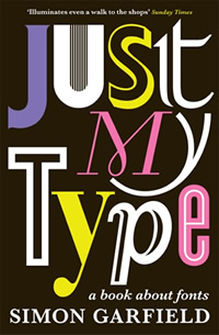
Just My Type
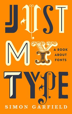
Just My Type
Just My Type is a book of stories about fonts. It examines how Helvetica and Comic Sans took over the world. It explains why we are still influenced by type choices made more than 500 years ago, and why the T in the Beatles logo is longer than the other letters. It profiles the great originators of type, from Baskerville to Zapf, as well as people like Neville Brody who threw out the rulebook. The book is about that pivotal moment when fonts left the world of Letraset and were loaded onto computers, and typefaces became something we realized we all have an opinion about. And beyond all this, the book reveals what may be the very best and worst fonts in the world – and what your choice of font says about you.
Today we can imagine no simpler everyday artistic freedom than the pull-down font menu. Here is the spill of history, the echo of Johann Gutenberg with every key tap. Here are names we recognize: Helvetica, Times New Roman, Palatino and Gill Sans. Here are the names from folios and flaking manuscripts: Bembo, Baskerville and Caslon. Here are possibilities for flair: Bodoni, Didot and Book Antiqua. And here are the risks of ridicule: Brush Script, Herculanum, Braggadocio and Comic Sans. Twenty years ago we hardly knew them, but now we all have favourites. Computers have rendered us all gods of type, a privilege we could never have anticipated in the age of the typewriter.
Yet when we choose Calibri over Century, or the designer of an advertisement picks Centaur rather than American Gothic, what lies behind our choice and what impression do we hope to create? When we choose a typeface, what are we really saying? Who makes these fonts and how do they work? And just why do we need so many? What are we to do with Alligators, Accolade, Amigo, Alpha Charlie, Acid Queen, Arbuckle, Art Gallery, Ashley Crawford, Arnold Bocklin, Auriol Vignette Sylvie, Andreena, Amorpheus, Angry, and Anytime Now? Banjoman, Bannikova, Baylac, Binner, Bingo, Blacklight, Blippo, Bebedot Blonde, Beach House or Bubble Bath? (And how lovely does Bubble Bath sound, with its thin floating linked circles ready to pop and dampen the page?) There are more than 100,000 fonts in the world. But why can’t we keep to a half-dozen or so familiar faces? Or perhaps we should just stick to the classic Garamond, named after the type designer Claude Garamond, active in Paris in the first half of the sixteenth century, whose highly legible Roman type blew away the heavy fustiness of his German predecessors, and later, adapted by William Caslon in England, would provide the letters for the American Declaration of Independence.
Typefaces are now 560 years old. So when a Brit called Matthew Carter constructed the now-ubiquitous Verdana on his computer in the 1990s, what could he possibly be doing to an A and a B that had never been done before? And how did a friend of his make the typeface Gotham, which eased Barack Obama into the Presidency? And what exactly makes a font presidential or American, or British, French German, Swiss or Jewish? These are arcane mysteries and it is the job of the book to get to the heart of them. But it begins with a cautionary tale, a story of what happens when a typeface gets out of control.
Can A Font Make Me Popular?
When Matthew Carter arrived for drinks at a private club in Leicester Square in May 2009, he was accompanied by his girlfriend Arlene Chung, and they started talking about films they might see together on their brief visit to London. Carter, a Brit long based in the US, had travelled from his home in Boston to see his children, and to give a lecture about revivals – the process of updating typefaces from the previous 500 years to suit today’s needs. He was such a popular draw that his talk had to be switched to a larger venue.
The lecture was not difficult for Carter. Now in his early seventies, the subject had occupied all his working life. But the choice of movie was more of an issue. It wasn’t the subject matter as much as the accuracy – so often when Carter sees films he notices niggly things wrong with type. How could a story set in Peru in the nineteenth century possibly have a sign on a restaurant door that had been composed in Univers from 1957? How could the film Ed Wood, set in the 1950s, use Chicago, a font from the 1980s, as the sign at the entrance of a studio? And how did the props team of a movie set at the start of the Second World War get the idea that it would be okay to print a document in Snell Roundhand Bold, when Carter, watching in the multiplex, would recognise the face as something he himself created in 1972?
Carter finds this sort of anomaly more amusing than annoying, but others take it more seriously, and bad type in film upsets them as much as bad continuity. On a section of his website called Typecasting, the designer Mark Simonson has set up a scoring system to denote just how badly filmmakers have got it wrong. He begins with Chocolat, the movie in which Juliette Binoche opens up a chocolatiere to bring joy to a sleepy 1950s French village. But the local mayor is no fan of type: pinning up a notice preventing the consumption of all but bread and tea during Lent, he has jumped forward a couple of decades to select a typeface (ITC Benguiat) not made until the late 1970s.
Inevitably, this sort of thing happens all the time. The Steve Martin film Dead Men Don’t Wear Plaid, set in the forties, gets three out of five stars for historical accuracy – shame about the use of Blippo from the 1970s for the cruise brochure. The Hudsucker Proxy, directed by the Coen Brothers, also gets three stars, despite its studied period feel (beatniks, hula hoops) being marred for type fans by a corporate logo set in Bodega Sands from 1991. LA Confidential (2-stars) fares worse, not least because the nameplate of Danny DeVito’s gossip rag Hush Hush looks suspiciously like Helvetica Compressed from 1974.
These are modern films, appearing at the cinema about the same time as graphic design was becoming all the rage at art school. You could sit in the stalls and not only know that something was wrong with a magazine nameplate, but also say why – too ornate, too recent, overly wrought. And we have recently begun to say not only what works, but what we like. ‘In the past,’ Matthew Carter observes, ‘people who had a very well-defined sense of taste in what they wore or what they drove, they didn’t really have any way of expressing their taste in type. But now you can say, ‘I prefer Bookman to Palatino’ and people do have feelings about it.’
Carter’s own taste is for suitability, and for meeting the expectations of his employers. He is not only one of the most highly respected type designers, but one of the few able to make a decent living from the trade. He is proud of a description in a New Yorker profile that tagged him as the most widely read man in the world. ‘A bit of an exaggeration,’ he reasoned, ‘but it got people interested.’ Carter is also one of the most eloquent exponents of his craft. He looks a bit like his type, a classicist with a ponytail.
He is the creator, notably, of Verdana, whose adoption by Microsoft has given it huge reach; of Georgia, the most legible and adaptable screen font; Snell Roundhand – based on an eighteenth-century calligraphic style, very festive, good for ironic party invitations; Bell Centennial, designed for the A.T.&T phonebook; ITC Galliard – a revival from the sixteenth century, tall and airy; and Tahoma, which, in its Arabic and Thai versions, is used by IKEA in place of their regular font – Verdana. The calligrapher Gunnlaugur SE Briem has described Bell Centennial as ‘a bulletproof rhinoceros that could dance Swan Lake’, and the same could be said for almost all of Carter’s work. There are at least twenty other Carter fonts, and his clients have included the New York Times and the International Herald Tribune, Time and Newsweek, the Washington Post
and the Guardian. Beyond this, his work is on almost every computer in the world, and on perhaps half the western world’s advertising.
‘At one time I dreaded that moment at dinner parties when people asked me what I did,’ Carter says. ‘Or when I sit next to a stranger on a plane. I was always tempted to pretend that I was a brain surgeon just to avoid the whole topic. Twenty years ago, no one had the slightest idea what a type designer was. If they had miraculously heard of it, they would say things like, ‘Oh, I thought they were all dead’.’
Nowadays, Carter believes, it would be very hard to find anybody over the age of six who didn’t know what a font was. ‘However, they don’t realise any human agency is involved, because fonts for them are part of the software ether that appears mysteriously on their computer, manifestations of some ghostly form. So they’re very astonished when they hear that people do this. I’ve had some very funny encounters with people since I’ve done a number of faces for Microsoft. Microsoft gave them away, which means they are everywhere on the planet. So now people say things like, ‘do you know this thing called Verdana? We’ve just had a memo come around the office saying we’ve all got to start using it…’ In some companies it’s dragooned that they have to all use it so no one thinks they’re getting any advantage by sucking up to the boss by using his favourite typeface.’
Occasionally people will ask Carter, ‘What typeface should I choose if I want to be really friendly? Can a font make me popular?’ He tells them he doesn’t know, that he’s at the raw material end of this, and that it’s all subjective anyhow. And it’s too easy to say heavy bold gothic types are serious, gloomy and sad, while light, flouncy, ornate ones resembling human script are optimistic and joyous. He has learnt over the years that there is truth in all of this, but he has also learnt it is easier to say what works than why. Good type is instinct born of experience.
Carter’s life in type is unusual and instructive. He has worked in three key areas of the craft. His father was a typographer and historian, and he helped find his son an unpaid traineeship at Enschede, a leading bank note and type foundry in the Netherlands since the beginning of the eighteenth century. Here he learnt to become a punchcutter, and the process of cutting letters in steel taught him about the beauty of the alphabet.
Carter then returned to London, and found there wasn’t much demand for skills rooted in the 1450s. So he began to paint signs, another archaic art. At the beginning of the 1960s he went to New York, and his journey into modern typography began. (Technically speaking, Typography is concerned with the appearance of type on a page or screen, while type design is concerned principally with the form of the letters.) After a while he was offered a job at the Mergenthaler Linootype Company in Brooklyn, the leading supplier of typesetting machines, and he set about improving their type library.
His subsequent career took him naturally into the new processes of phototypesetting and designing for the computer. In 1981 he co-founded Bitstream Inc, the first significant digital type foundry, and a decade later he left to form Carter & Cone with his business partner Cherie Cone. It was here that he was commissioned – newspaper by newspaper, typeface by typeface – to establish the new look of much of what we currently read in print and online.
Businesses and institutions employ Carter because there aren’t many font designers who have such an intricate knowledge of type history. For a man specialising in revivals this is obviously a prerequisite – and it is an attribute often lacking in the generation that followed him. Computers have obliterated the manual labour of casting letters by hand, but it is not just the craft that has disappeared; it may be the rounded worldview that such craft brings. Carter says he once went to a fair where someone was offering a poster from the 1840s advertising a forthcoming sale of slaves. He knew immediately it was a fake – its typeface originated from the 1960s. Once again, type can tell you much more than words on a page.
Where did Matthew Carter’s knowledge begin? With his mother, who just loved the shape of letters. Before he went to school and learnt to read or write, his mother had cut out the alphabet from linoleum. She had trained as an architect, and drew beautifully. Many years later, he found the remains of these letters in a box. ‘They were Gill Sans,’ Carter says, ‘and they had tooth marks on them.’